

Including a form on your landing pages is one of the quickest ways to convert visitors into leads. There are many ways to design a form and an endless list of fields you could include. Let’s take a look at some of the biggest things you can do right now to optimize your conversion rates using great Lead Generating form design.
If it isn’t Necessary Right Now, Leave it out
Your company has decided to include a form on their website to convert new leads. Now the question is, what information do you need to gather from your lead? When asked about things to avoid when creating a PPC landing page, conversion expert Tim Ash recommends, “Keep forms as short and concise as possible. Only include fields where it’s absolutely essential for the existing transaction.”

Too many fields in a form can scare off a potential lead. Respect the users time, if you have come as far as convincing someone to sign up for your product or request more information, it is crucial not to waste more of their time than is necessary when they finally reach the form.
The Vague
How often do you find yourself filling out a form and under the “Name” field there is that silly field for “Company”? It is usually on a website that your first thought is, “why do they need to know?” Then direcly under that in the infamous “Address” field, with no more explanation than a single word. So now is it your address they want or the company you work for? One single field can and will confuse most of your potential leads.This is exactly what happened with Expedia’s form and by correcting it they started seeing $12 million of profit a year. When Expedia customers saw an optional form field labeled “company”, they interpreted it as a place to fill in their bank. When the following was the “address” field they proceeded to fill in the address to their bank rather than their personal, home, address. As you could expect, when Expedia when to verify the address to process the customer’s credit card, it failed due to an incorrect address.

Even asking for an address can sometimes blur the lines or necessity. If you aren’t going to ship them anything, they are going to question the reason you are seeking the information out. Ask only what is relevant and absolutely necessary.
The Short and Valuable Form
Now that all the unnecessary information isn’t in your form, let’s take a look at what should be in your form and how you can make it successful.There are fields that are very important to your lead gen form. For example, it is great to get the person’s name. This allows for personalization when sending an email or when you call your new lead. Speaking of emails and phone calls, you need a way to contact this person. Including an “email” field is a pretty good idea but really, a phone number is your bread winner. What better way to make contact with someone that personally calling them, this will also allow you to get some of that information that we left out of your form initially.
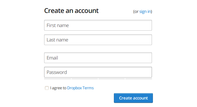
In the above form for dropbox, you will notice that they also included a field for a password. If your form is a product this is a great field to include so they can securely sign in and out of their account. It is also clear that there is no “username” field. In this case the email satisfies the need.
Calling attention to your form
Now, let’s make it clear why your visitors should fill out the form on your page. A key component to any lead gen form is a clear call-to-action.

Notice MailChimp doesn’t show the form directly, but there is a bold message letting its customers know what they are signing up for, “Easy Email Newsletters” and is accompanied by a bright red “sign up Free” call-to-action button. Don’t be afraid of using bold standing colors to call attention to your buttons.Lastly, let’s chat placement. According to Amy Oliver, Consumer Experience and Conversion specialist, “Form location above the fold of the page, make sure visitor doesn’t have to scroll down to see it.” This is a great point. Placing it above the fold ensures that all page viewers see the form. If you place it somewhere on the page and needs scrolling you may be losing out on potential conversions.Now that you know some of the does and don’ts of creating a great lead generating form try it out for yourself and watch your leads increase!
.svg)