

A great call-to-action will provide your visitor with noticeable instructions on how to take the right action on your page. The primary goal and general rule of thumb when designing a call-to-action is making sure it leads your visitor(s) to your defined target such as a product purchase or site conversion. In this blog post I will discuss creating and designing a great call-to-action, using the call-to-action for lead generation, knowing your overall purpose, writing text that matches your call-to-action, implementing a design that stands out and knowing how many call-to-actions are needed.
Lead Generation
Call-to-actions are the most important element of a lead generation campaign. Each of your marketing campaigns, materials and or miscellaneous tactics should include a call-to-action - one that is cohesive with each piece. Before you finish with each marketing element you should be asking, “What is the call-to-action and what behavior are you trying to get out of your target audience?” To learn more about lead generation click here.
Your Purpose
You cannot create a call-to-action unless you know your purpose and desired outcome for your target audience. On your website, you may want your visitors to fill out a sign-up form, whereas on your postcards, you may want people to call. Once you know the purpose of your call-to-action you can better create enticing text and unique design that stands out on your page and distinguishes you from your competitors.
Text Matters
A recent eye tracking study showed that website visitors preferred reading text than viewing heavy graphical content. With that said, each has its place and purpose. A balance should be found for the two so they work together to reach your desired purpose. People looking for a particular product or information on that product will expect a certain balance of text and images, so knowing your target audience will help you determine how much of each to use.

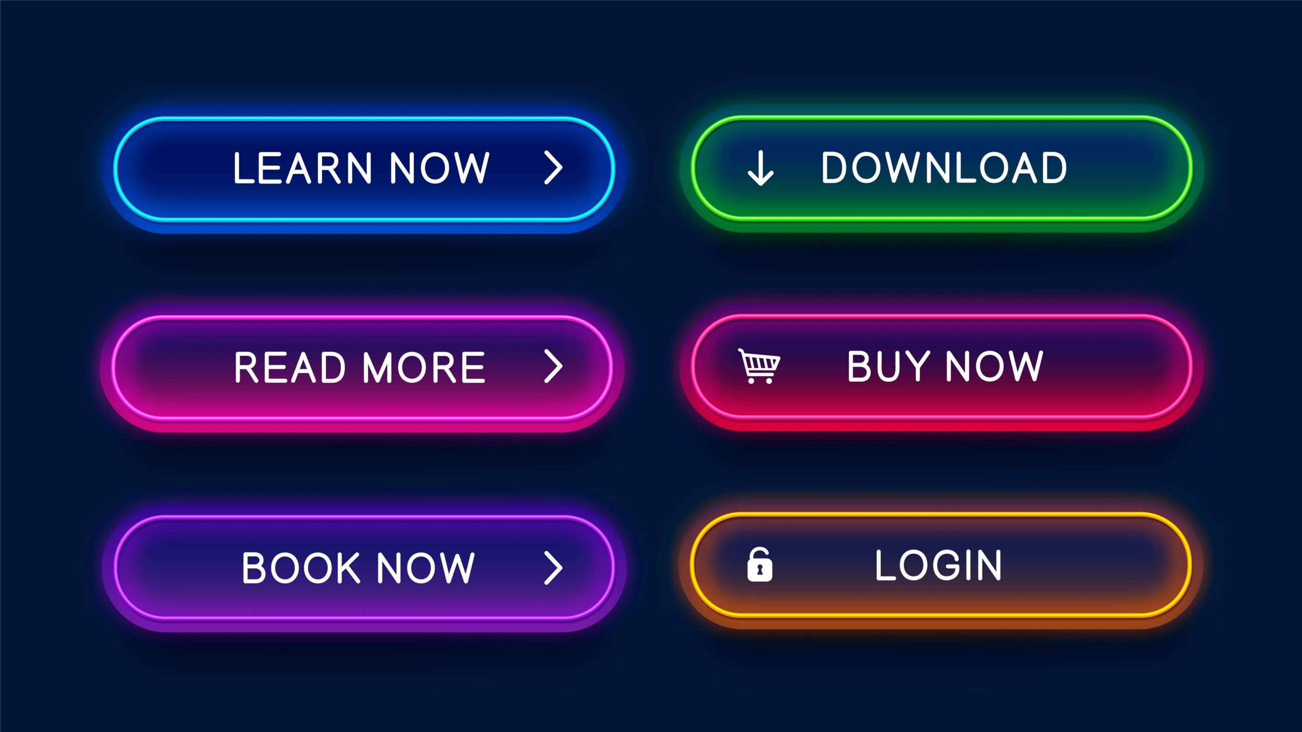
Your call-to-action should be clear and easy to find on the page. It should also be specific and action-oriented. Instead of saying “submit,” try offering something and say, “Download Your Free Trial.” You could also say something like “Start Saving Now,” or “Begin Your Journey.” The key is to create a call-to-action that offers something of value and/or be action-oriented so your visitors understand what they are supposed to do to follow through and convert. Simply put, a call-to action-should
- Bring attention to your site
- Create a way to measure your sites success, and
- Give direction to your users.
Designing the look and feel
Because online marketing has been growing rapidly, most of this piece will talk about tips to help design your online call-to-actions and not focus on the more traditional marketing materials. After you have determined the>purpose of your page, outlined the benefits of your product, set your goals and wrote your headline, you can then begin the design element of your call-to-action. Before beginning to build and design your call-to-action(s), be sure to review these 5 tips first:
TIP #1: Stay Focused, it has been proven that if a shopper is offered too many options or varieties, they get confused and don’t make a purchase at all. By reducing the number of options for your users and instead of creating a step-by-step process they can follow, you will increase your lead generation results.
TIP #2: Position Properly, where you place your call-to-action is one of the most important elements of design. A designer will be able to place the CTA in a location that will get it noticed and then also add design elements to bring even more attention to it. Typically, your first call-to-action should be centered on the page and above the fold. This doesn’t mean that others can’t be also located below as long as the first is above.
TIP #3: Use White Space, it is not only the position of your CTA or the colors used to create it but also the space and colors around it. The more space around your call-to-action, the more it will stand out. De-clutter your site now for better results.
TIP #4: Think Color, it is important to try alternate colors when designing your CTA button, especially if your site pallet is somewhat neutral. For instance, if your site is all blues or earth tones, try throwing in a bright orange button instead. Giving extreme contrast for your users makes it easier for them to see your call-to-action. Colors opposite on the color wheel, such as blue and orange, provide contrast while still being aesthetically pleasing
TIP #5: Make it Big, a call-to-action should be prominent on the page and easy to view. Text is something someone will read through to gather information, but a call-to-action should not be viewed the same way. Make it big enough to call attention to the desired action you wish your user(s) to take.
More Than One CTA?
Some websites, landing pages or marketing materials only need one call-to-action (CTA) because they are small or very simple marketing pieces.

However, in most cases websites in particular need more than one call-to-action and in most cases multiple. However, keep in mind that these call-to-actions are not in one place - each individual page should still only contain one call-to-action. Many websites such as coach.com, disney.com or allstate.com require multiple call-to-actions. Some are repetitive while others have a new purpose and desire. Postcards or other tangible marketing pieces typically have one call to action; to either call or go online to learn more. Make sure you do not clutter your marketing piece with too many call-to-actions. You still want each one to stand out for its own intended purpose. Conduct proper research and studies to analyze your results and change as needed. Also, make sure each page on your site has a call-to-action that fits with the content on that particular page.
Final Thoughts
The days of simply copying and pasting a “submit” button onto your website or marketing piece are over. To get the best results possible, you need to create actionable call-to-actions that stand out and push your visitors to take the next step. Powerful call-to-actions marry together best practices of usability, creative visual design and effective copy writing. Now that you have learned a bit more about call-to-actions, their benefits, purpose, and how to implement them, look at your current ones and change as needed. If you are changing your call-to-actions, most of the time other changes are needed as well to align the overall look and feel of your marketing piece.
.svg)